
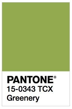
Greenery, Freshness and vitality arrive to Pantone 2017.
The bets are on!! Wishing to find out what colour that will define the trends in 2017, we were in tenterhooks. The colour disputed were the yellow Naples evoking the stars and the sun´s brightness, the soft colours were referenced by excellence in noble materials, the wood, or the sum of yellow and blue like nature in its maximum expression.
Leatrice Eiseman, Executive director of the Pantone Institute of Colour, just revealed what tones denominated Greenery, Reference Pantone 15-03043, Selected by the group of experts that each year after numerous sociologic and cultural studies, dictate the reference colour.
The sun, Wood, the green lungs… sustainability in a rise in decoration like a form of environmental protection, it gave us a hint that the trend is betting for everything natural in this year 2017.
Re-discover nature trough Pantone Colour.
Refreshing and revitalizing colour green is the symbol of new beginnings. The objective of Pantone is to intensify the value by means of codes that inculcates the resurface of nature.
Between the threat of disappearing and the hope of the rebirth, the nature has to face a world conditioned by technology, suburbs and excessive taming of everything… the forms and materials reconnect with the elements to reencounter harmony with mother earth.
 Green is a fresh tone with yellow hints that evokes the first days of spring, when the green leaves revive and get restored and renewed. Illustrative floral foliage and the open air freshness, the attributes of a green fortification which invite consumers to inspire, oxygenate and revitalize.
The more people submerge in the modern life, the greatest the innate wish is to be absorbed in the physical beauty of the natural world. This change is reflected in the proliferation of all the things Greenery transmit, in the everyday life by means of an urban planning, the architecture, life style and the design option worldwide. Pantone[…] LLC
Re-adapting commercial spaces.
Redecorate a space to maintain it in concordance with the trends is a hard task, when it comes to homes it can seem 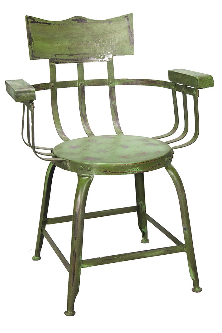 capricious but the planning varies among the commercial sector, Design turns into a solvent added value where to differentiate is key in all business.
Redesign to renew an establishment is possible working the aesthetic, adapting it to the trends and actual demands of the clients.
Whichever is the space, to renew is an investment that can be amortized in short time, is viable due to textiles, accessories, furniture… Having in mind the attributes of colours to increase profits.
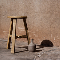
Natural & Organic the Natura Spirit.
When it comes to interior decoration, colours have the power to radically transform the appearance of a space and the sensations that transmit to its inhabitants or users. To be inspired in the wild environments to embody the natural spirit it’s not new in interior decoration, in fact the Natural and Organic keeps on a rise.
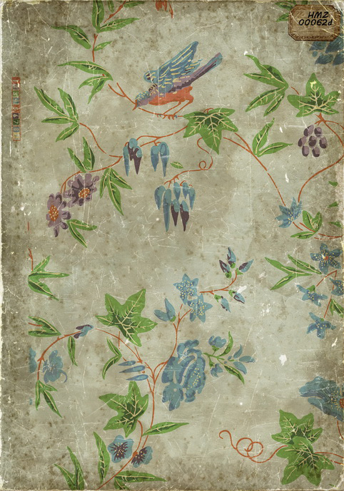
Wall papers is a respectful way to bring nature close to the modern world, our vintage wallpapers have rugged finish, worn made in an artisan form, not continuous illustrations and characteristics that give spaces a splendorous breeze.